
Set the stage: its mid-2017, and Brit + Co is in a bind.
Taxmann is basically dealing in Software, websites and printing media for their all Taxesand Corporate laws of India. They have more than 6 separate website Income Tax, Corporate Laws, International Taxation, GST, Indian Acts and Rule, Indirect Tax, Accounts & Audit.
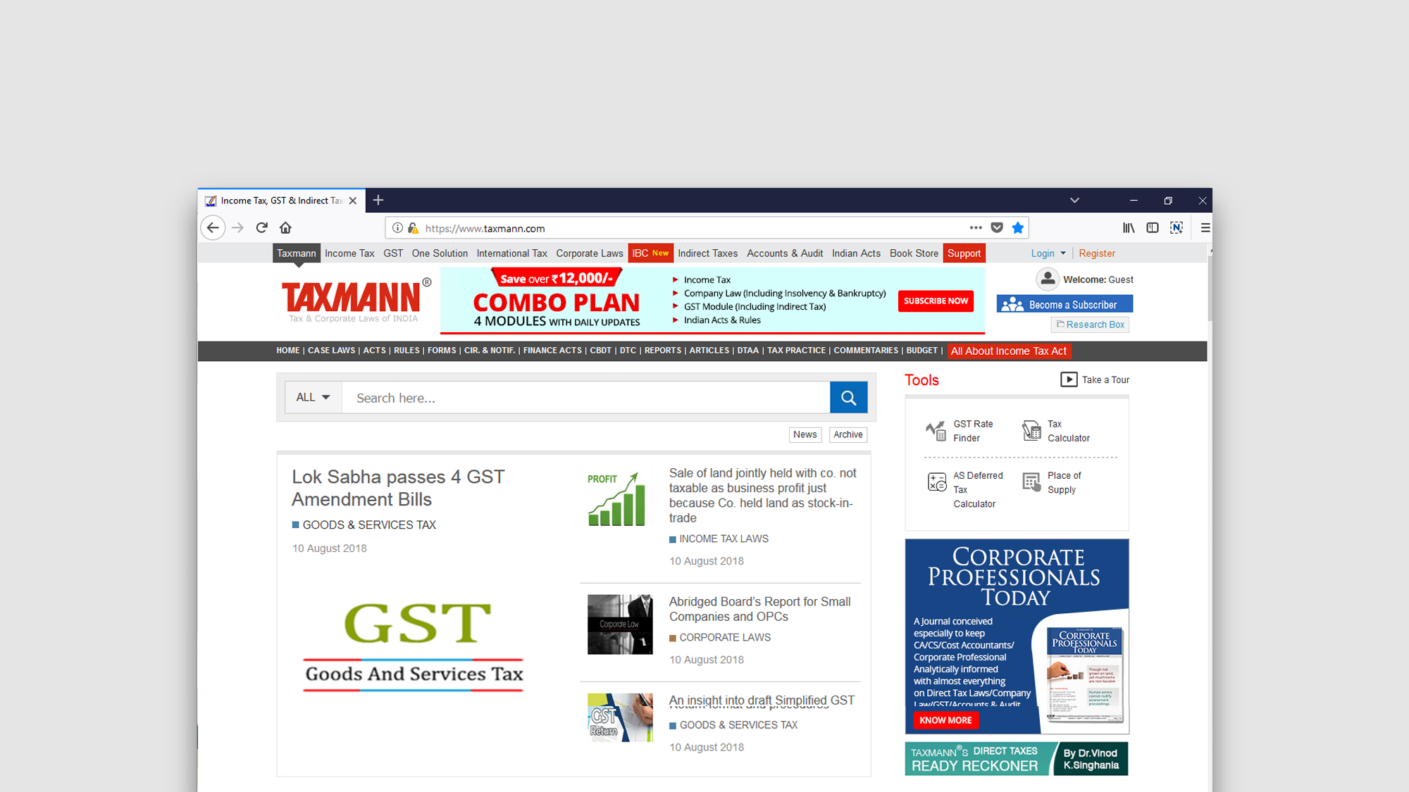
Problem - There were full of content, of all related Taxes but user traffic was less and user was facing lots of problems while they filtering data as per their need and also a mesh of search engine
What they wanted me to resolve - I was tasked to to give solution to give a better filter option, good search engine and mainly their result page should have more power. . I imagine a rich, high quality storytelling experience packed with knowledge… that’s SEO-friendly, fast, and modern… that connects with our readers and helps solve her problems?
How might we… I have studied the existing sites, seated with the customer service team, also discussed a lot with a CA team who is preparing the data as per Tax laws, also discussed with the sales team as well. I started with this inspirational idea. But getting there would take some time, testing, and a completely new workflow across the company.
Finally I worked for
Three Column Result View
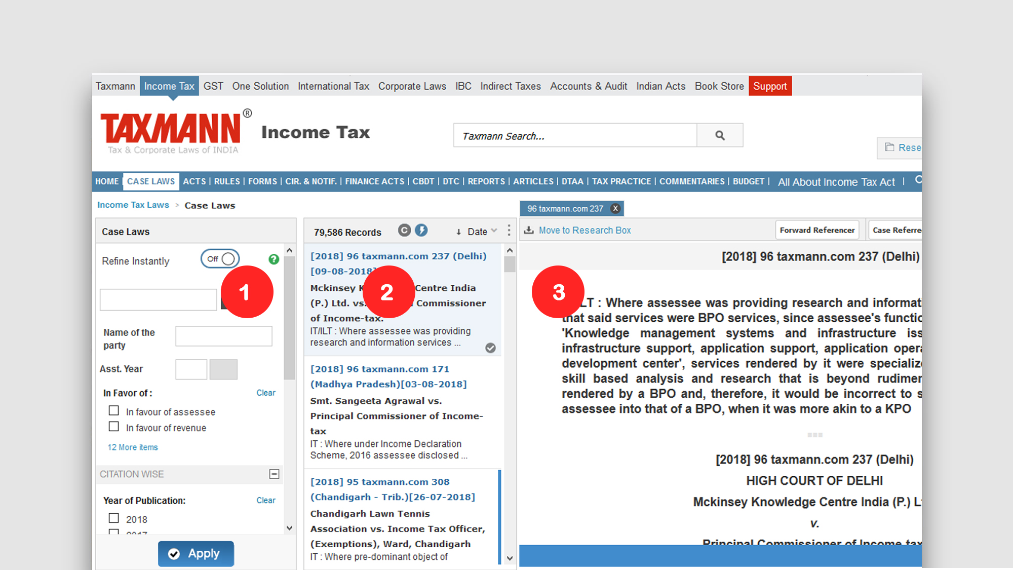
Left side Result Filter Options
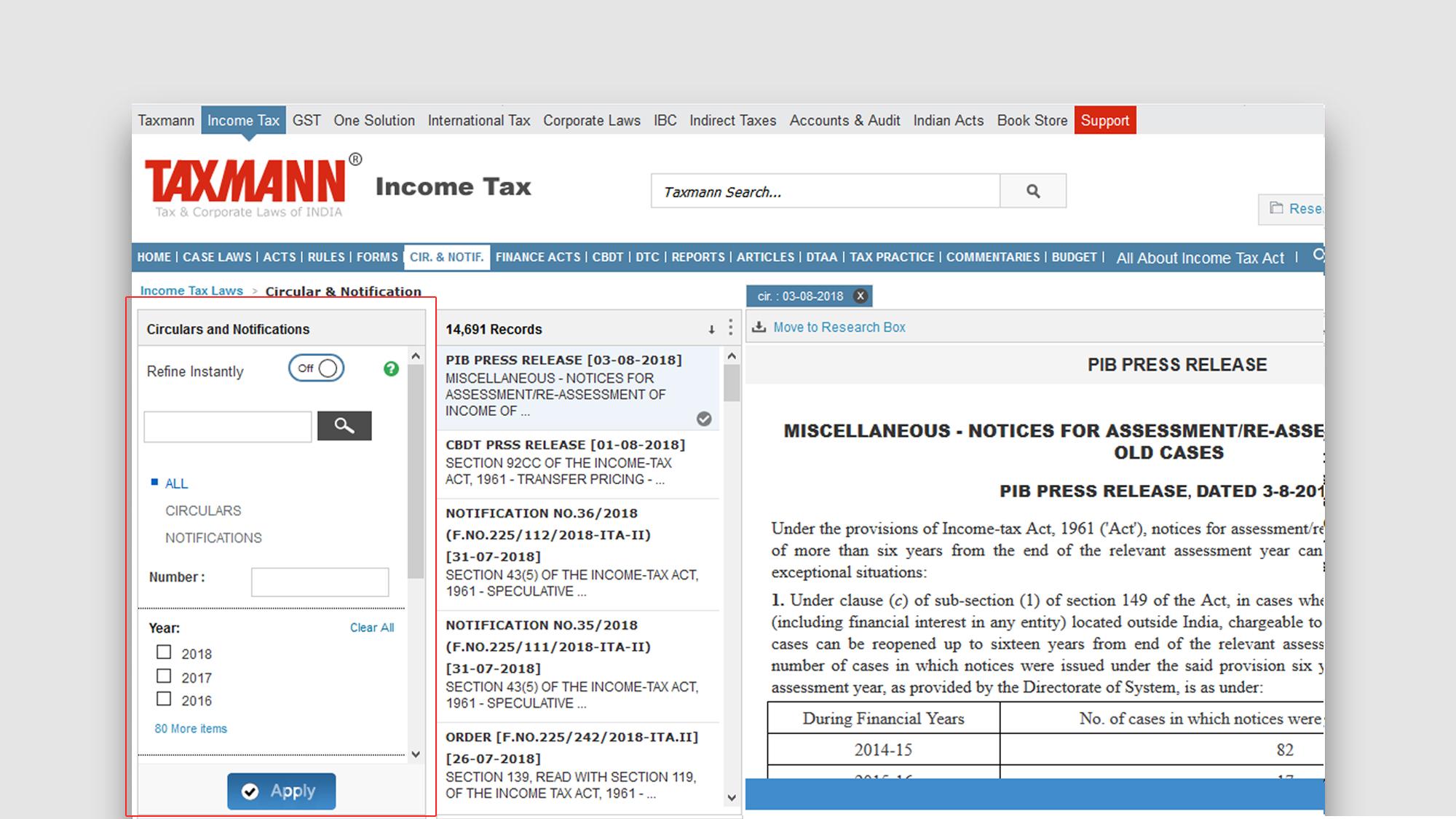
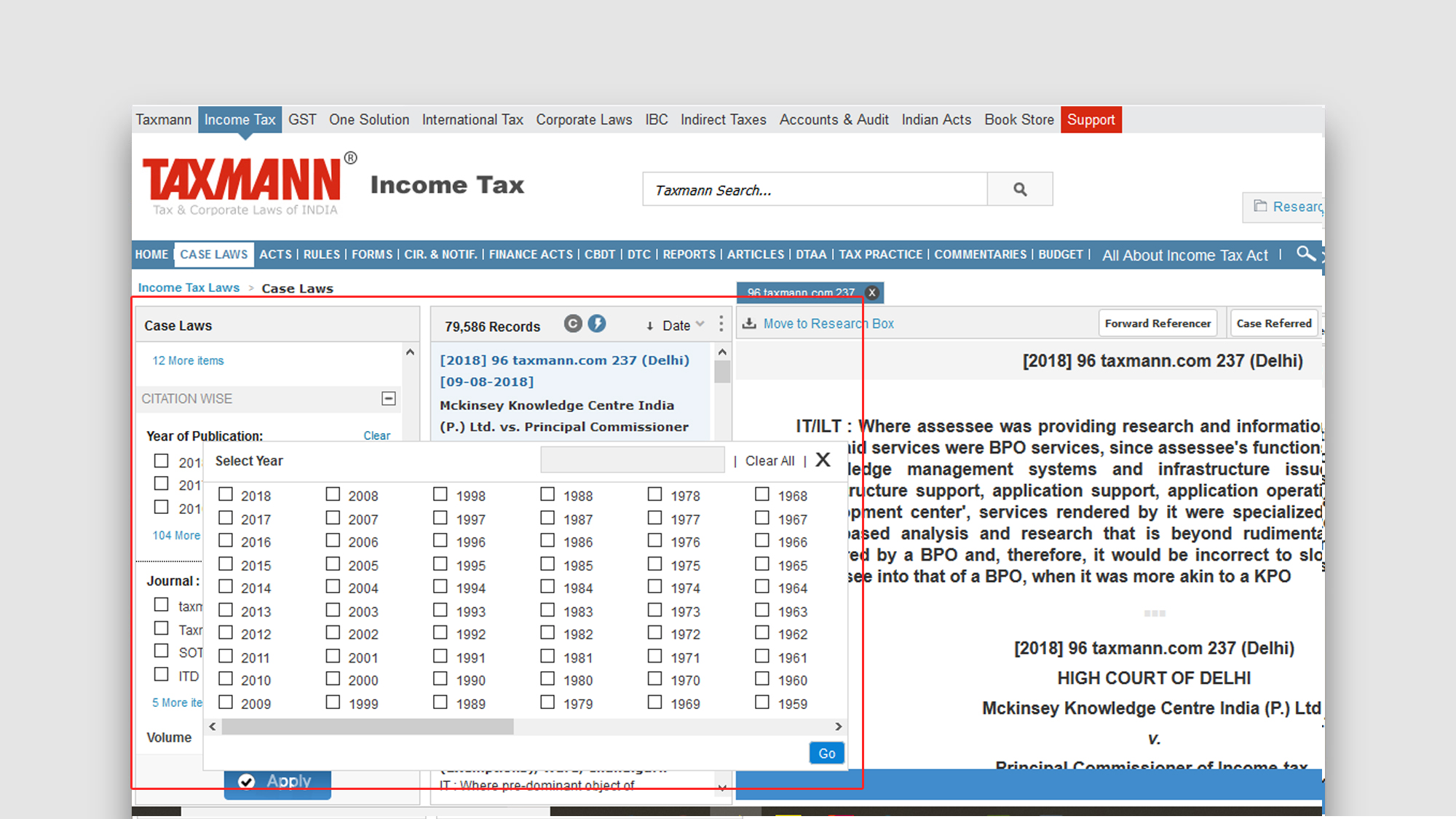
Left side More Filter Options
Max View Option for Result Document
Other Important Useful features
Search Result Page with Addtional Refrences Features
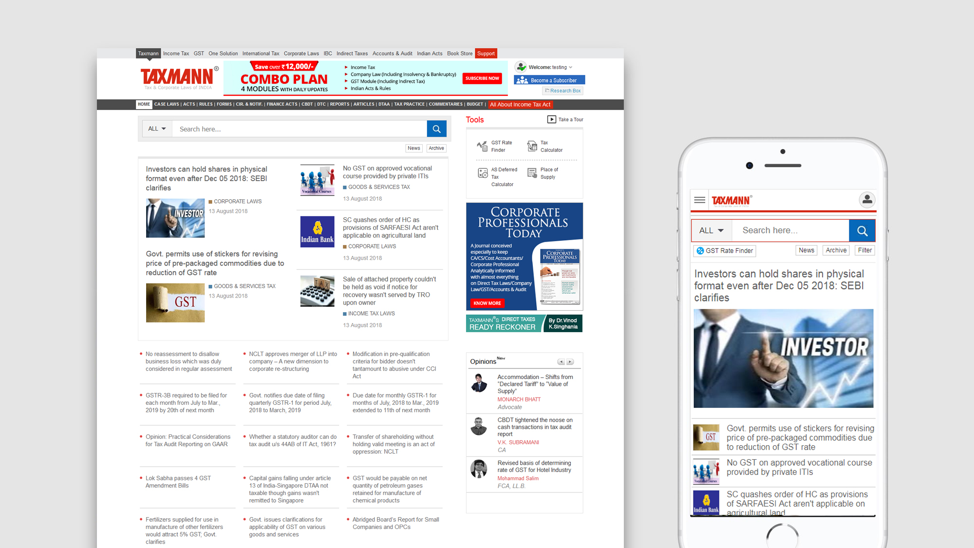
Mobile View
With those learnings in mind, our second iteration would face a bigger test: can we scale this format?
To test the ability to scale, we worked with key editorial contributors to determine two guides that could be developed around the same time with our new editorial tool. A video-heavy holiday cookie guide and a photo-rich holiday gift guide would be good for testing.
After working with editorial stakeholders to determine the minimum to make both guides successful, I embarked on competitive research for both the Cookie and Gift Guides to compare what content we’ve created in the past with what other media companies were producing.
I also pulled knowledge from internal usability testing. We found that readers scrolled quickly and often, skimming content but bouncing before reaching the end. I marked this as an opportunity: how might we enable our girl to scan more content, reducing bounce rates?
My first design cycles consisted of acting as idea generator. I would work with our editors to develop potential functionality and layouts based on the stories they wanted to tell.
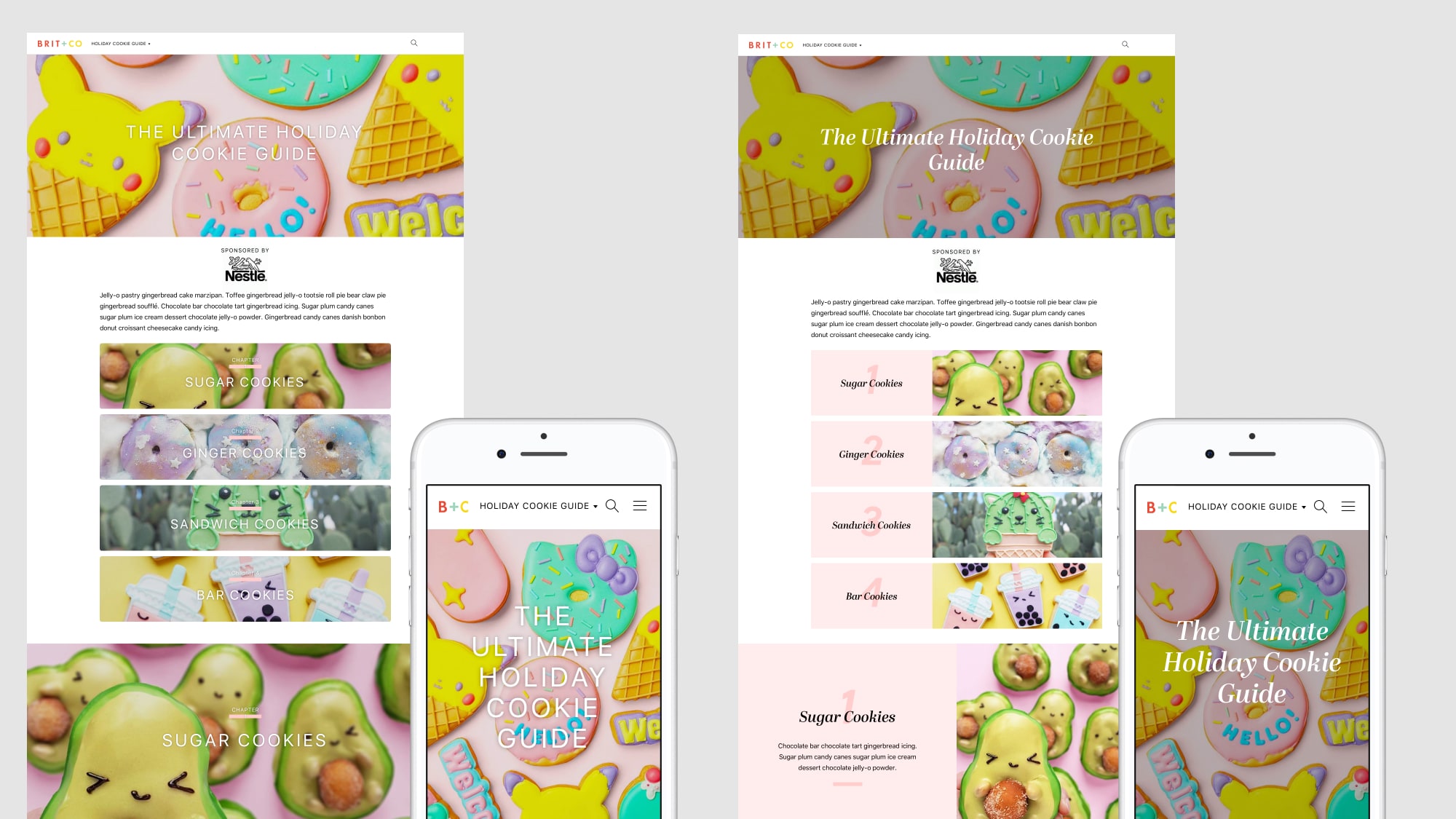
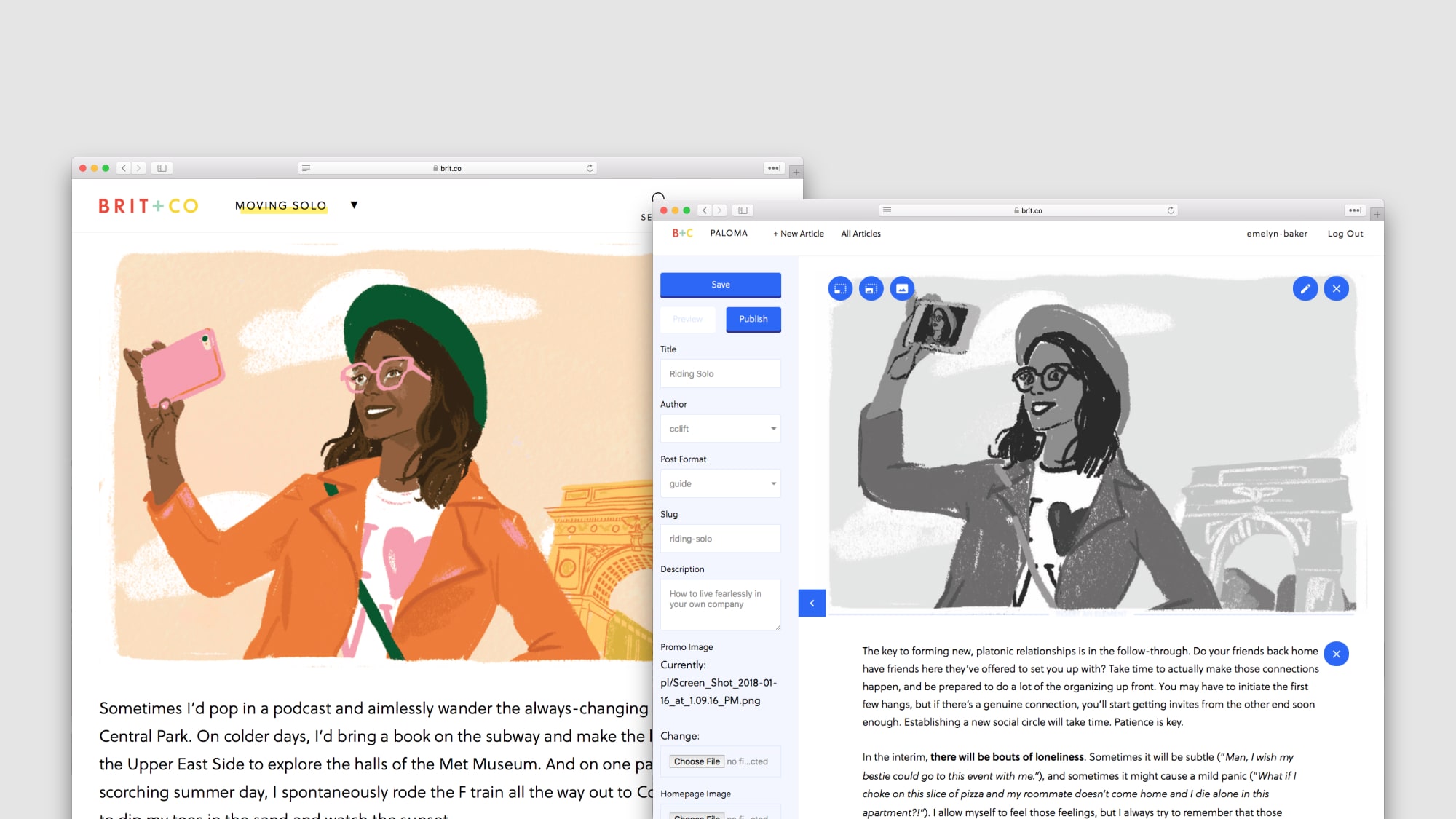
For the cookie guide, I designed video-heavy layouts that reflected the initial structure of the denim guide. I also designed a second scanning/scrolling compontent — we called this the Table of Contents — and a recipe module to help structure the content in a more digestible, skimmable way.
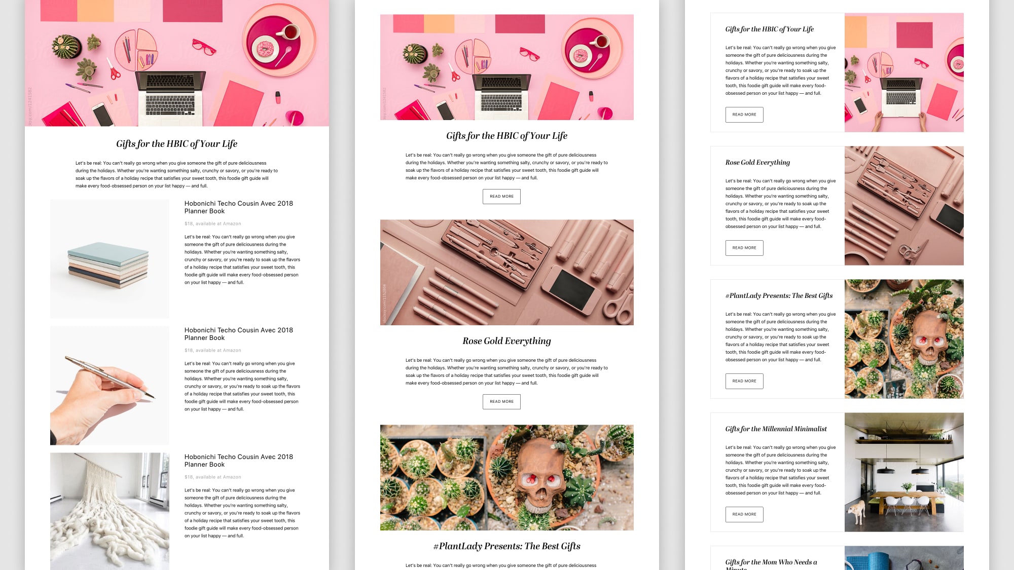
For the gift guide, I explored a few different options, but had a lot of difficulty making the denim guide layout work. We explored a few different directions but ultimately concluded that the requirements for the gift guide differed too far from the denim and cookie guides.
After iterating on both, we concluded with a final mock for the cookie guide including two new features: a different visual layout for chapters including a Table of Contents, and a recipe module.
As editorial and I settled on a layout, our photo and video team began documenting the cookie making process — one of the great perks of working at Brit + Co.
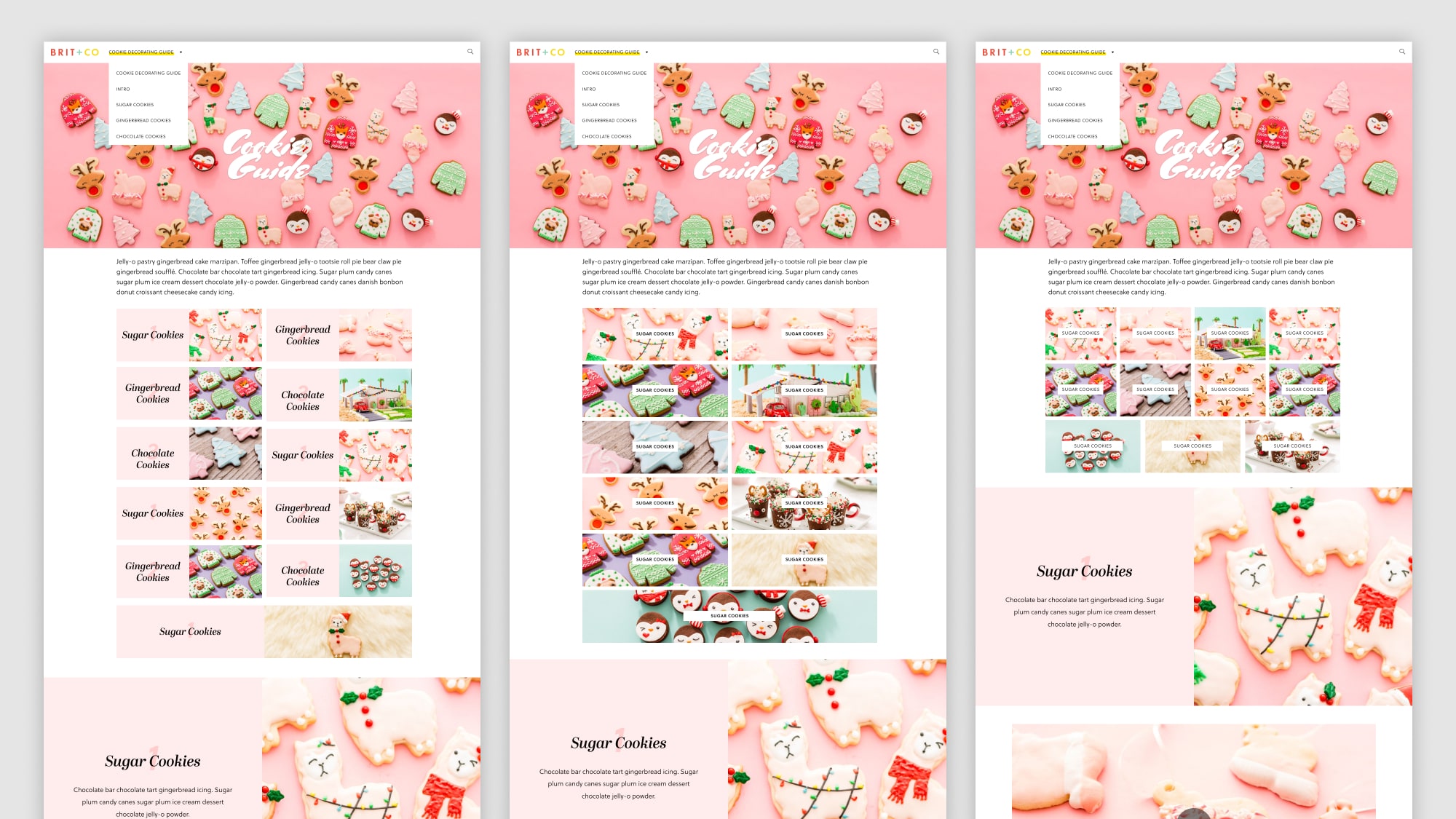
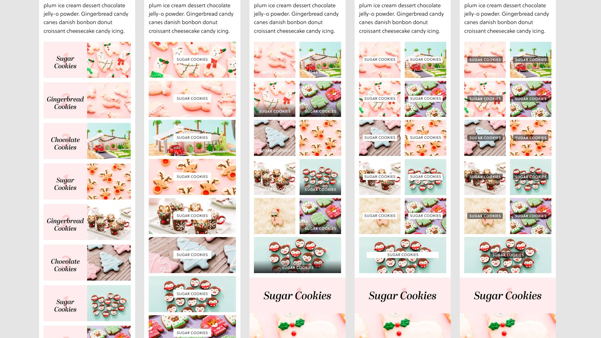
We encountered another problem as stakeholder requirements changed shortly before launch. The problem in question was the Table of Contents module. I’d iterated on a few versions, and the one we chose was big and beautiful. However, it worked best for guides with 2–8 chapters — our proposed limit. However, new sponsors arrived at the last minute and pushed our chapter number to 11. The Table of Contents was simply too long on the mobile experience. At the last minute, we reverted to an earlier design to handle a larger, more dynamic number of chapters. I worked with an engineer, Julie, to design a dynamic grid that accommodated any number of chapters from 2 to 20 that worked for most on desktop, tablet, and mobile experiences.
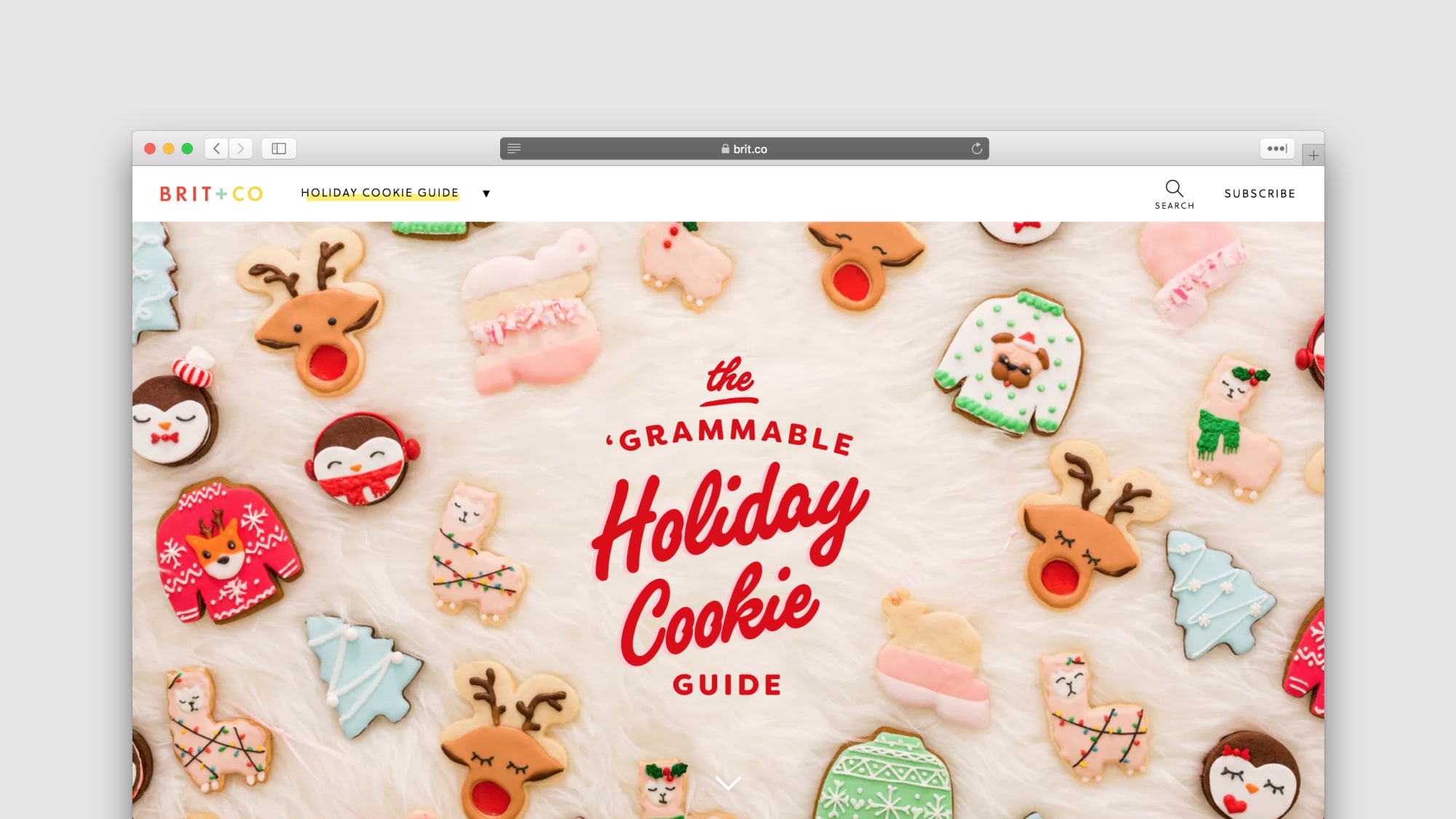
By launch date, we successfully published our Holiday Cookie Guide, a rich multimedia experience built that extended our interactive destinations framework. We saw success with individual creative assets across multiple social channels, and we’ve seen this cookie guide creep steadily upwards in SEO rankings.
Our takeaways from this version:
This project is a work in progress, and while some successes will only become apparent over time, I would like to note immediate victories.